Advanced CSS
Introduction
We'll be discussing three properties of elements that are important for building a layout using CSS.
- Position
- Display
- Float
Positioning
Positioning is how elements are placed on the screen relative to other elements around it.
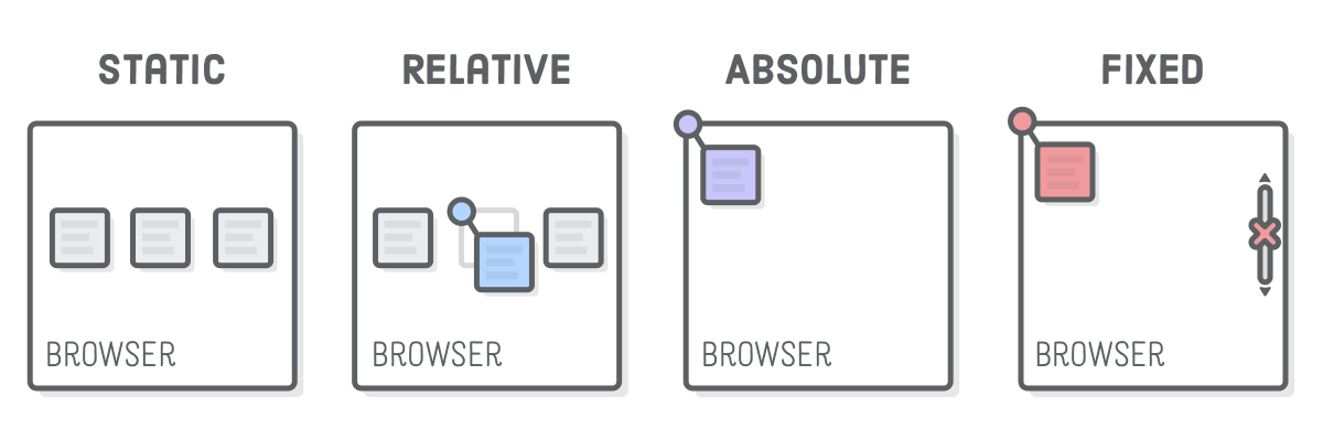
Static
Static is the default positioning, where the elements will follow the normal flow of a web page.
What's the normal flow? There are two types of elements inside a webpage:
- Block boxes flow vertically downward starting at the top of their containing block and normally takes the full width of the containing “block level element” unless otherwise specified. One block element placed directly below the preceding block element. Block elements are DIV, P elements.
- Inline elements reside in a block level container or inside a block level element and they appear side by side in normal flow. If they reach the right most wall of container then the inline elements (i.e their box model) wraps to next line within the container and stays horizontally.
If an element is static, it's not affected by top, bottom, left, and right properties. It doesn't want to listen to you!
Relative
An element with position: relative; is positioned relative to its default
static position.
By setting top: 20px;, the element will be adjusted away from its default
static position and move upward for 20px.
Fixed
A fixed element is positioned relative to the viewport.
The element's position relative to the screen will not change even if the user scrolls.
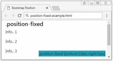
Does not leave space in the page where it would statically have been located.
Use top, bottom, left, and right to place.
Absolute
An absolute element is positioned relative to the nearest positioned ancestor (instead of positioned relative to the viewport, like fixed).
Can use this to layer on top or under other elements
When there is no explicit positioned ancestor, it uses document body as the ancestor.
Use higher z-index to layer on top of other elements.
Use top, bottom, left, and right to place.
Gradient background is absolutely positioned.
Sticky
Sticky is very similar to relative in terms of positioning.
However, when the user scroll to the element, the element will become fixed
position and "stick" on the screen.
Essentially toggles between relative and fixed.
Use top, bottom, left, and right to place.
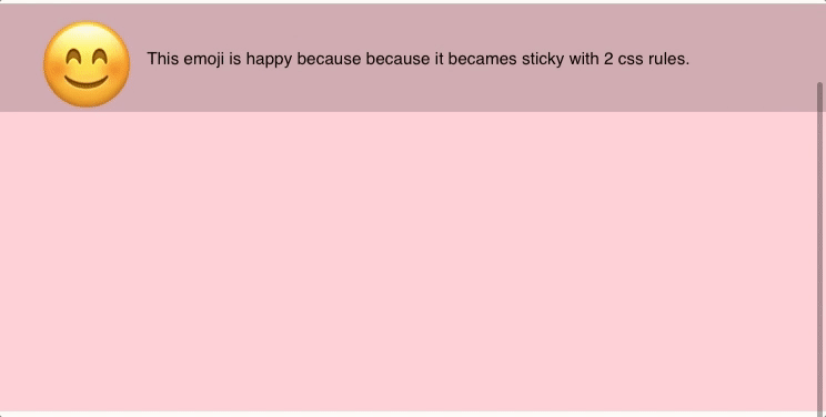
Once it hits a position on scroll, it will stick to it.
Diagram for Positioning
Display properties
Elements you create are rendered as boxes on a page. Previously, we looked at how we can position these boxes on the page, but you can actually do a lot more with this. That's where the display property comes in.
Display properties describe the type of rendering box around an element. Some of the different styles we can use include...
- Inline
- Block
- Grid
- Flex
- None
Inline
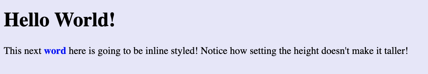
Displays an element as an inline element (like span). Any height and width properties will have no effect.
Inline elements are arranged one after the other. Like any othr style, these elements are contained in boxes that are placed adjacent to one another. A common use for inline elements is for buttons placed side-by-side.
span {
  /* Span is default inline */
  color: blue;
  font-weight: 700;
  height: 40000px;
}
<body>
  <h1>Hello World!</h1>
  <p>
    This next <span>word</span> here is going to be inline styled! Notice how
    setting the height doesn't make it taller!
  </p>
</body>
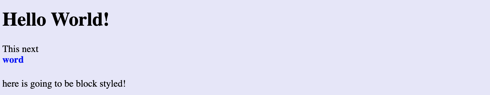
Block
Displays an element as a block element (like p). It starts on a new line, and takes up the whole width. (default) It generates a line break before and after the block when in normal flow.
Notice how there is a gap under "word" due to the height property now being used! Compare to above example where height is ignored.
span {
  display: block;
  color: blue;
  font-weight: 700;
  height: 40px;
}
<body>
  <h1>Hello World!</h1>
  <p>This next <span>word</span> here is going to be block styled!</p>
</body>
Flexbox (crowd-favorite)
This is the most popular layout option.
Makes it easier to design flexible responsive layout structure without positioning. The main purpose of a flexbox is to fit all elements within the container by changing the flex dimensions. The flex container can shrink and stretch as needed, making it very useful in responsive websites where element sizes change.
A huge benefit of the flexbox is that it is content aware. Different rows uniquely respond to elements within based on available space. It is one-dimensional along rows, so it can change item widths without notice of columns. Take advantage of this by avoiding specifying a width when creating the CSS for a flexbox. This removes the main flexible purpose of using the flexbox since items will no longer be dynamic.
The flex-grow propery specifies how items in the flexbox should take up available space. The value defaults at 0, and it must be specified within a CSS class specific to the element. This is similar to the flex-wrap property, which will wrap items To the next line if there are too many elements present in the container.
You can use the justify-content property to align the elements contained within. When items are inflexible, it helps with using available space in the flexbox to align them across the container.
By default, a flexbox attempts to place all elements on the same line. However, by specifying flex-wrap, you can spread elements across multiple lines.
flexbox alignment can be very confusing. It's important to keep track of your items since they can stretch and shrink differently based on how you define the many properties.
Can specify direction of flex, spacing, justifying, alignment, etc...
.class {
  display: flex
  flex-direction: row | column | row-reverse | column-reverse
  align-items: flex-start | center | flex-end
  justify-content: flex-start | center | flex-end | space-between | space-around
}
Here are some resources to learn more about the usage of the flexbox display option:
Grid
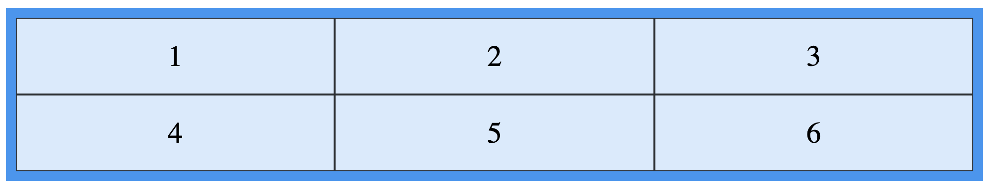
This is an easy way to lay out your elements in a grid. A Grid places the elements in a two-dimensional matrix. The vertical lines are columns and the horizontal lines are rows. Using a Grid allows you to change the dimensions of the columns and rows, making it a strong choice for placing elements. However, realize that the Grid doesn't have to be a perfect matrix. You can merge columns at specific rows, wrap content, and give individual items different widths to customize the layout.
The display: grid is one of the newer layout methods in CSS and is very powerful,
however it is also complicated so we recommend only using it when you truly have a
grid of items, and display: flex is not good enough.
Grid container
A Grid container is the element that contains the items of the Grid. We can create a Grid container by specifying the display properties (see the example at the bottom of this section).
Grid lines
Grid lines form the grid layout that divides the container into rows and columns. They can be referenced using an index that starts at 1 from the top left corner. This means that the first row grid line is index 1 (not 0, unlike Python and Java arrays/matrices).
Grid cells
Grid cells are formed at the intersection of a row and column Grid line. They are bounded by exactly 2 row lines and 2 column lines to form a box. This is where you can place elements into the Grid. Grid cells are the smallest possible unit of space on the Grid
Grid area
Grid areas are formed by combining one or more adjacent Grid cells to form a larger space. Therefore, Grid cells are also Grid areas.
.grid-container {
  display: grid;
  grid-template-columns: auto auto auto;
  background-color: #2196f3;
  padding: 10px;
}
.grid-item {
  background-color: rgba(255, 255, 255, 0.8);
  border: 1px solid rgba(0, 0, 0, 0.8);
  padding: 20px;
  font-size: 30px;
  text-align: center;
}
<div class="grid-container">
  <div class="grid-item">1</div>
  <div class="grid-item">2</div>
  <div class="grid-item">3</div>
  <div class="grid-item">4</div>
  <div class="grid-item">5</div>
  <div class="grid-item">6</div>
</div>
A display: grid element has quite a few properties which can be confusing. Here are some
resources to better understand how to use the Grid layout:
When to use Grid vs flexbox
When your items are positioned in a single dimension (i.e. all in a straight vertical/horizontal line), then they can generally operate very similarly. In this case we recommend using Grid.
The key difference arises in two-dimensional layouts, if you want items to
fluidly wrap, then use flexbox with flex-wrap: wrap, otherwise, use Grid.
Float
The float property used to be popular back when layout methods like flexbox
and grid didn't exist. Now that they do, float isn't used very much because
it's behavior can be confusing.
Float can be either "left" or "right", shifting the element to the left or right of the container that it is encapsulated in. The rest of the content will be wrapped around it.
Suppose we had an inline <img> nested within a <p>. Setting the image's
float property to "right" would place the image to the right of the container
and wrap the text above, to the left of, and below it.
Cascade and Specificity
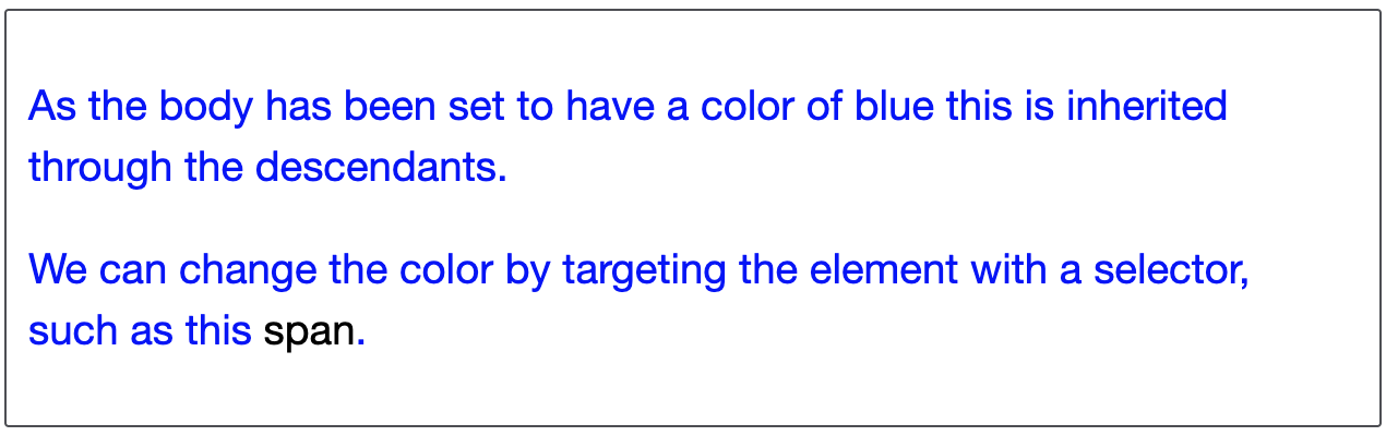
CSS stands for "cascading" style sheets. What does "cascading" mean? It's the idea that an element's style is "cascaded" from various places (its parent element, a class, the browser's default styling, etc.)
CSS needs to have some rules to figure out which source to use for a given element's
style. In the example below, you can see how the text "span" has two potential sources
for its color: it could inherit its parent p's color, or use the span style. In this
example it's pretty obvious how to best resolve this conflict: use the style of the
closest parent, but you can get into more complex cases where it's not as obvious. This
brings us to the next concept of "specificity".
p {
  color: blue;
}

span {
  color: black;
}
<p>
  As the body has been set to have a color of blue this is inherited through the
  descendants.
</p>
<p>
  We can change the color by targeting the element with a selector, such as this
  <span>span</span>.
</p>
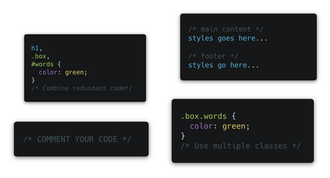
Order in CSS classes does matter! Whatever comes last in your CSS document is what stands.
Specificity
We must be able to handle conflicts and troubleshoot our CSS in a logical way.
Specificity is how specific a certain CSS styling attribute is. To determine specificity, you can follow this system.
More selector specificity means that it will override the styling of an element also styled by a less specific CSS selector.
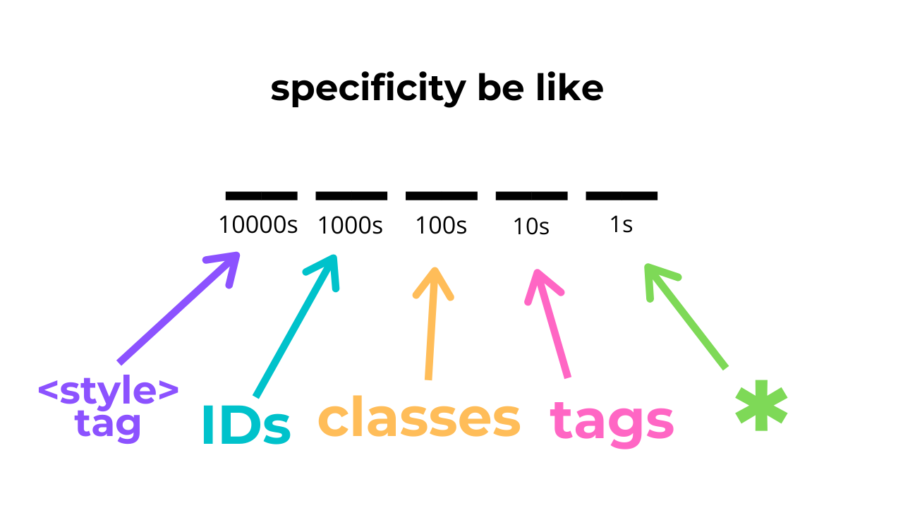
This convention is not a real CSS rule. It is just for the sake of remembering the hierarchy.
Here are a few examples:
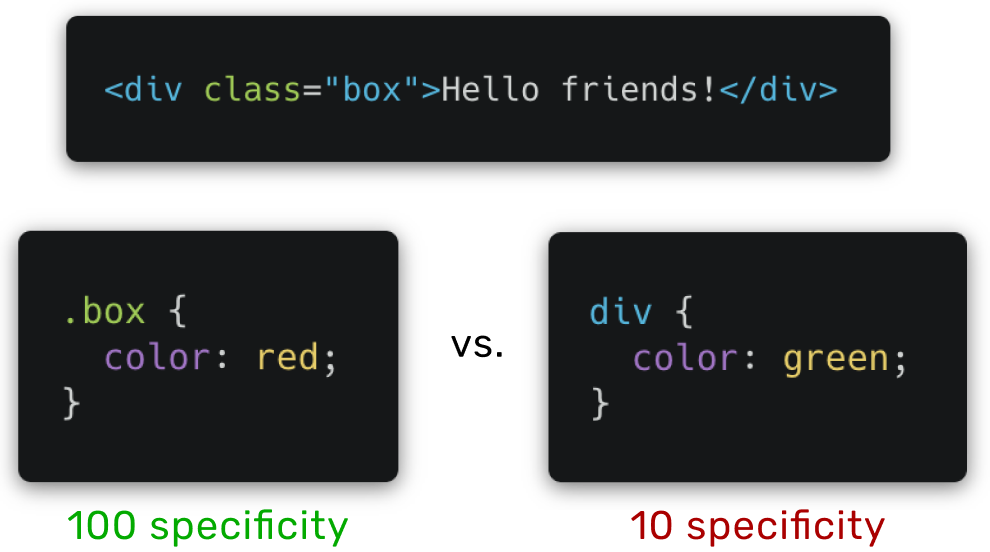
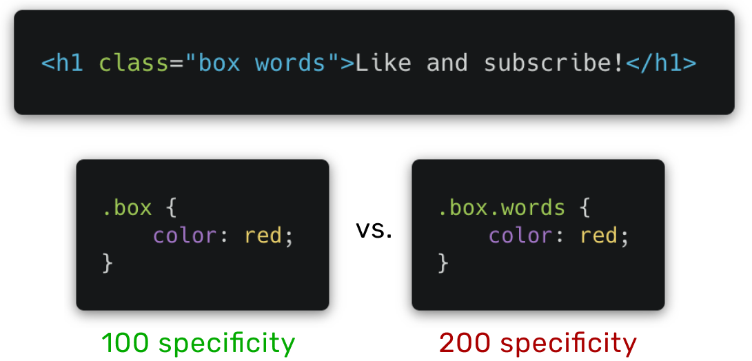
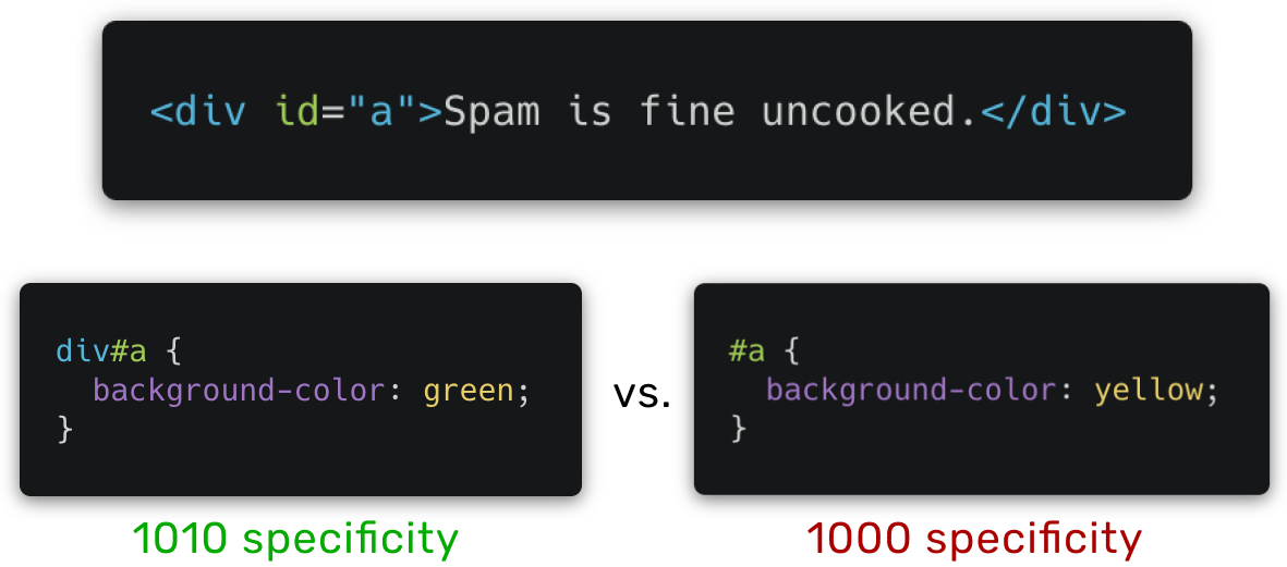
The green specificity numbers indicate the styling selector that overrides the other.
Notice how the highest number ALWAYS overrides the lowest.
Dev tools is great for when this gets confusing! Any overridden styling will
appear with a strikethrough.
Animation and Media Queries
Pseudo-classes and Animations
A pseudo-class is used to define a special state of an element
- Some examples: :hover, :focus, :first-child
- anchor specific tags: :active, :link, :visited
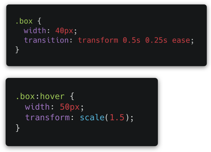
transform
One powerful use of pseudo-classes is its cooperation with the transform property
Example: size an element up when you hover over it
Other ways to animate are using JS. We will go over these later
transform + transition
Here’s the syntax:
- In the original element, specify transition.
- In the pseudo-class, specify transform.
Can specify speed, delay, and style of transition.
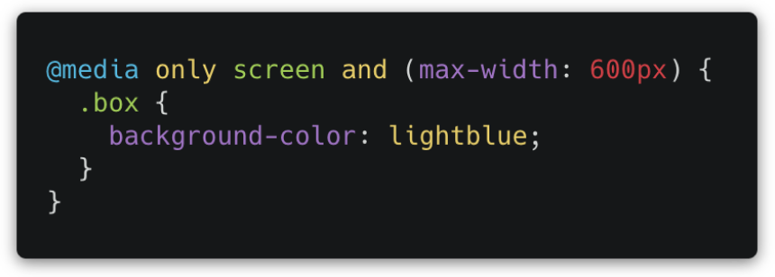
Media Queries
Media queries allow you to change the CSS of the page based on screen size.
Change element sizes, change flex direction from row to column, etc...
Can add as many as needed in your CSS file
Can check width, height, resolution, and orientation of device.
Common breakpoints:
- 320px — 480px: Mobile devices
- 481px — 768px: iPads, Tablets
- 769px — 1024px: Small screens, laptops
- 1025px — 1200px: Desktops, large screens
- 1201px and more — Extra large screens, TV
Good Practice
Contributors