Introduction to CSS
Introduction
Okay, now we've begun putting HTML elements on a page. Using our house-building analogy, this is like we have all the materials now in a pile in front of our house.
However, a pile of lumber ≠ a house.
We're going to start styling our pile of lumber so it looks like a house with the next programming language known as Cascading Style Sheets (CSS).
CSS is a programming language where you specify a list of "styling rules" that tell
the browser how things should look. Conceptually like: "all h1s will be colored red" or "all
images will be 100 pixels wide".
Simply, CSS is a way to take the HTML elements that you have on the page and style them to look nice.
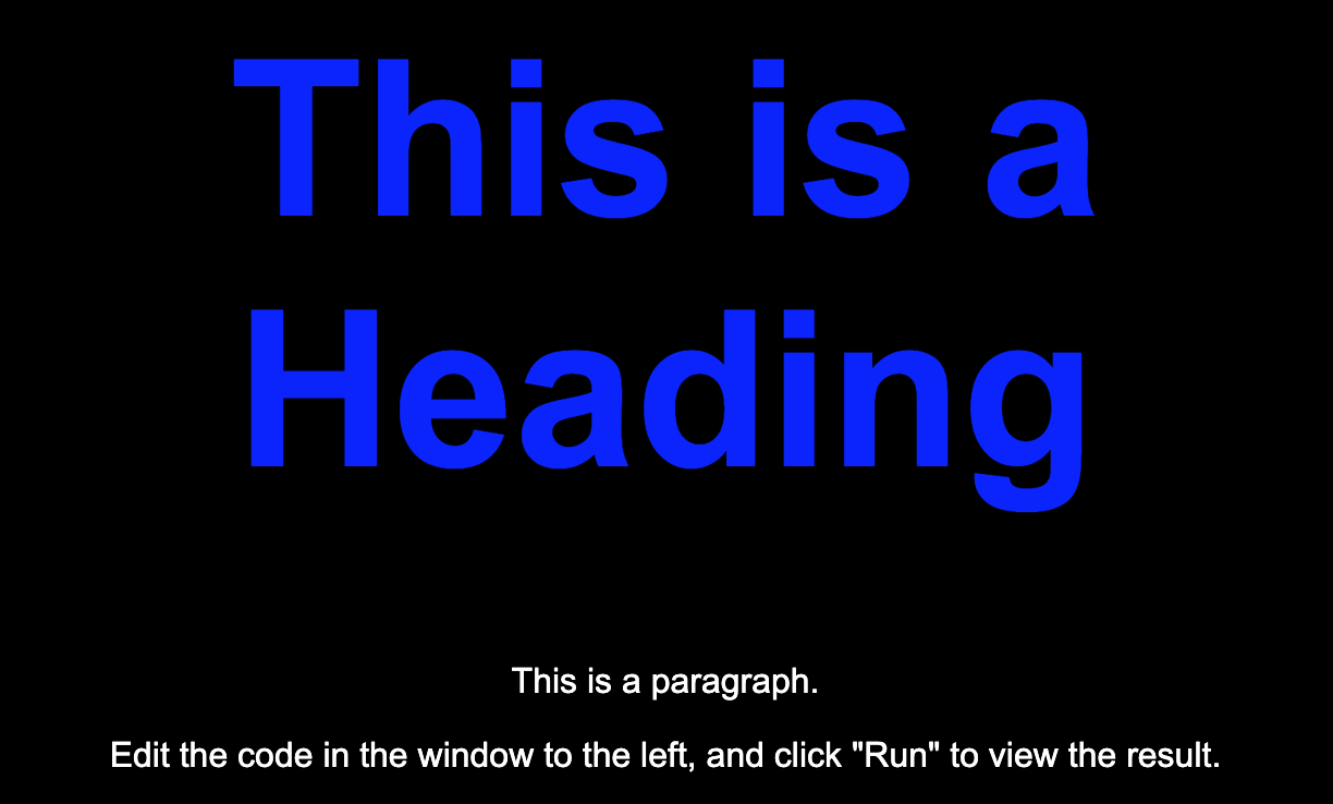
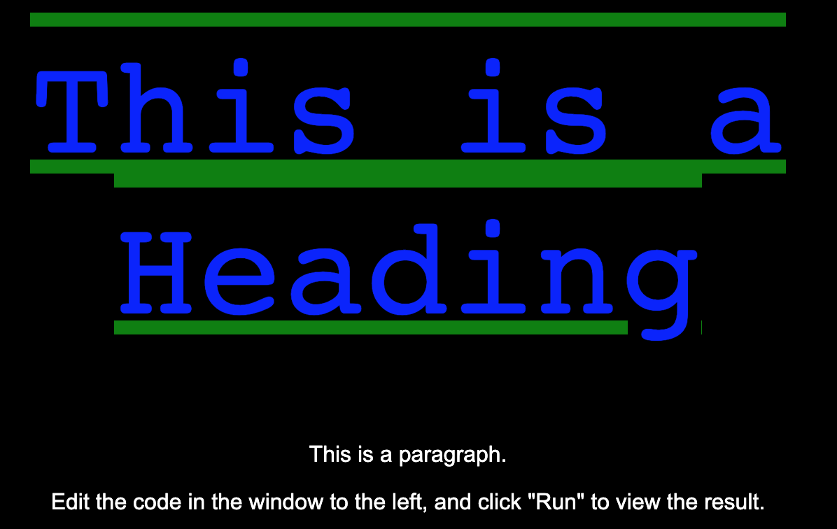
Take for example, a site with no CSS styling. Doesn’t look great!
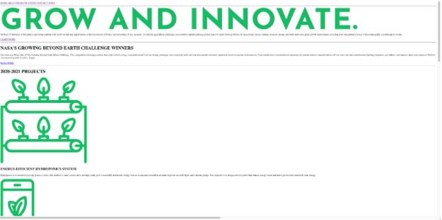
The above is a site with no CSS styling.

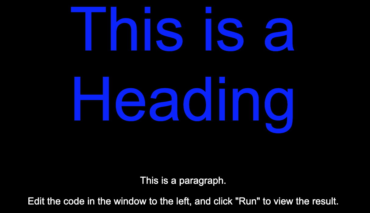
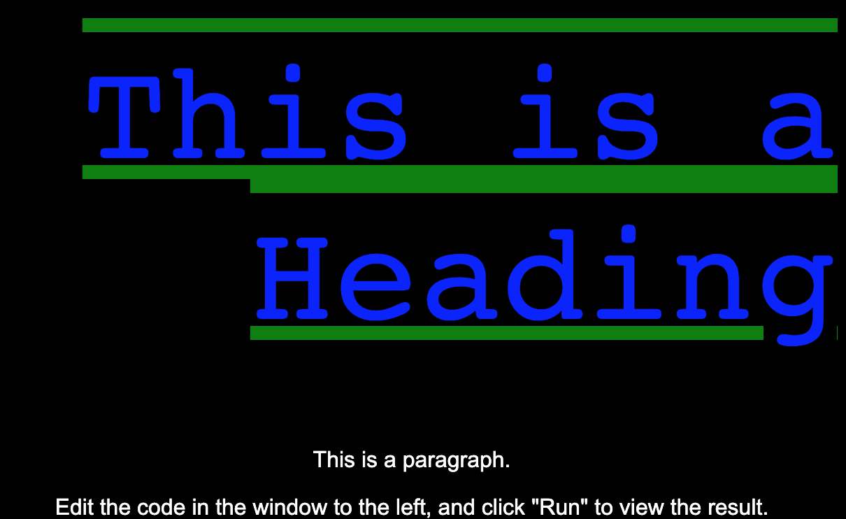
The above is a site (the same HTML!) with CSS styling.
Crash Course
A CSS document consists of groups of styles which have three parts:
selector: an expression which states which elements you're changing the styles of. We'll dive in later into what these actually look like!
rule name: the name of a pre-defined styling property which controls a part of how an element looks. For example, this can be
colorfor changing the text color, orfont-sizeto make text bigger. We will teach you the most common ones, but there hundereds of CSS properties out there!value: this is the value of the property, it can sometimes be a keyword like
bold, a color likered, a size like12px, or even more complex things! We will also dive into all the different kinds of values things can have later on.
The best place is MDN. MDN is a very reputable and accurate place to get very accurate and detailed descriptions of what CSS properties there are. However, just Googling and using sites like Stack Overflow is the best way to get examples of how to style things as a beginner!
When put together, your CSS document looks like
<selector> {
  <rule name>: <value>;
}
Let's put look at this in a real example so it makes more sense.
Example: Changing text color
<p>This text is now red and bold</p>
p {
  color: red;
  font-weight: bold;
}
Here, we use the p selector to match all p tags. Then we set the color
property (which controls text color) to red which is a built-in color into CSS. This also uses the font-weight color to make the text bold.
Where to put the CSS
So where does this CSS code go? Let's explore the two approaches:
link tag (recommended)
The most common and recommended way is to put your CSS in a seperate .css file.
To tell HTML where your CSS file is located, you are going to put a <link rel="stylesheet">
tag inside the <head> of your document. You can have multiple stylesheets.
<html lang="en">
  <head>
    <link rel="stylesheet" href="../style/about.css" />
  </head>
</html>

<!-- This tag usually goes in the head of the HTML document -->
- It's good coding practice to "separate your concerns", meaning you keep styling to its own file (CSS file), and content to its own file (HTML).
External stylesheets have a .css ending
If you use multiple stylesheets, they may conflict with each other, for example by using the same selector. In general, the stylesheet inserted last will take precedence. You will learn more about the specific conflict-resolution algorithm used in CSS in the next lesson, also known as "specificity".
style attribute
If you have some CSS properties you want to apply just to a specific element, you
can also use the style HTML attribute:
<h1 style="color: blue; text-align: center;">Header</h1>

<!-- In this example, the h1 has color blue and center aligns itself -->
- The
styleattribute will override any style set globally, like styles specified in the style tag or in an external stylesheet. - This will only style the element that it’s applied to.
- This is good for elements that do not follow a specific pattern
This is strongly not recommended because it makes your HTML code look very messy (although the authors do admit they do it themselves now and then).
style tag
Another way to use CSS is by inserting CSS classes directly into the HTML document at the very top.
<html lang="en">
  <head>
    <style>
      h1 {
        color: red;
      }
      p {
        color: blue;
      }
    </style>
  </head>
</html>

<!-- This stylesheet lies within the HTML document and will affect the entire HTMl page -->
- This is usually not preferable for long CSS documents.
- Overrides external stylesheets
CSS Selectors
CSS searches for elements in your HTML to style. So we need a way to tag/identify certain elements so your CSS knows where to look and what to style.
Tag selectors
This is the simplest selector, just use the name of the HTML tag you wish to select!
- Tag selectors select elements by tags
- For example, you can select all elements with the
<h1>tag, or<p>,<a>,<img>, etc…
h2 {
  color: red;
  width: 20px;
  height: 40px;
}

/* All elements of type h2 in your HTML will be affected. */
Class selectors
A class name is an attribute you put on an element in your HTML, and then you
can apply styles to all elements with that attribute. In CSS to specify a class,
prefix the class name with a .
<img class="team-photo" src="maverick.png" />
<img class="team-photo" src="goose.png" />
.team-photo {
  color: red;
  width: 20px;
  height: 40px;
}

/* All elements of class "team-photo" in your HTML will be affected. */
A tag can have multiple classes. Say I wrote two CSS classes, "team-photo" and
"big-picture", I can apply both those classes using <img class="team-photo big-picture" />
ID selectors
An ID is just like a class except that only one element can have an given ID.
To specify an ID in CSS, prefix it with a #
<h1 id="header-block">This is red</h1>
<h1>This is unstyled!</h1>
#header-block {
  color: red;
  width: 20px;
  height: 40px;
}

/* The element of ID "header-block" in your HTML will be affected. */
Naming CSS IDs and Classes
You generally want to give things useful names.
There's a saying in computer science that there are two hard things in computer science: cache invalidation, naming things, and off-by-one errors. (Cache invalidation is another topic for another day.)
So if you struggle to come up with names for things like classes and IDs, you're not alone. As a programmer you get to name a lot of things.
With classes, you want to name things semantically. This is a fancy word that you want to name things as close to what thing is and not what it looks like.
Example: Imagine this is a blog post on my website.
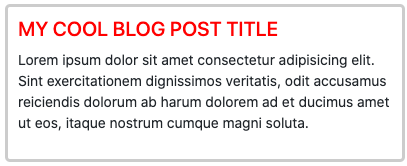
For the blog post title, what should I call the class? What tag should I use?
I really can use any tag and it'll mechanically work. Using CSS, you can make pretty much any tag look and act like any other. So if it doesn't matter mechanically, why should it matter to me?
For the reasons we layed out earlier:
- It makes the site accessible to everyone if you choose good IDs and class names. It's your responsibility to make sure the web remains accessible to everyone, including but not limited to: people with limited sight, limited motion of hands, arms or other limbs, limited hearing, and other permanent or temporary disabilities.
- It'll make it easier for you to come back later and maintain your code or for someone else to understand what you did. Code is communication between you and future readers.
- It makes it easier for Google, Bing, DuckDuckGo, etc. to crawl your website which means your site will rank higher in search results.
Screen readers and other accessibility tools do not read your class names or IDs; choosing good names here purely affects you and others working on this code
Given that, it means we need to choose a tag that means that's a title. In this
case, we can use an h1 because that is the main header of that subsection.
For the name of the class, how about red-title? It's a title and it's red;
fits, right?
While that may seem appropriate and fitting now, what if you need to change your blog's styling the following week and now that blog post looks like this:
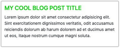
If your title is still called red-title, you have a bit of a problem! Now your
class name is not only not descriptive of what the item is, it's actually wrong
which will make it way more confusing to you and other laters.
Now, you may say that you can just change the class name when you go to update but believe me that's not a good option either. If you've used that class 1,000 times throughout your website (not that farfetched) you'd have to update 1,000 different things.
It's better if we give it a good name the first time, descriptive of not what it looks like but descriptive of what role it serves.
In this case, we could call it something like blog-post-title or post-head
or something of that nature. That class then always be descriptive of what the
thing is and not what it looks like.
Selectors (Advanced)
The universal selector
The * (universal) selector affects ALL the elements in your document. This is
super overkill for 99% of cases, so we don't recommend using very often.
Most properties you want to globally apply (e.g. changing the font with font-family)
you can do on your html element and it'll be "inherited" by all its children (we'll
dive-deeper into what properties are inherited in the next lesson). For example:
html {
  font-family: "Comic Sans";
}
is a better way to make all text the same font instead of *.
OR Grouping Selector (,)
If you want to apply a group of styles an element that matches any selector in a set,
separate them using a ,
- This reduces code clutter and makes it less repetitive.
h1,
h2,
p {
  text-align: center;
  color: red;
}

/* All h1, h2, p elements will be affected. */
AND Grouping Selector
If you want to apply a group of styles to an element that matches ALL the selectors in a set, squish them together like:
h1.my-title.red-text {
  color: red;
  font-size: 50px;
}
This applies the styles to ONLY h1 classes that have both the my-title and red-text
classes.
Hierarchical Selectors
If you want to select a tag that appears as a child (at any depth) of a tag, seperate them by a space:
.text h1 {
  color: blue;
}

/* All h1s inside of .text classes will be affected */

.text {
  width: 2rem;
}

.text .pretty {
  color: green;
}

.text .ugly {
  width: 4rem;
}

/*
".text" classes as a default are of width 2rem and color black.
".text .pretty" classes have width 2rem and color green.
".text .ugly" has width 4rem and color black.
*/
Common CSS Properties
So you've seen a few CSS properties, but lets dive into the most common ones:
Text
color: changes color of the text
.heading {
  color: blue;
}
font-size: changes size of the text
.heading {
  font-size: 100px;
}
font-weight: changes heaviness of font. lower = lighter, higher = bolder- 200: Ultra Light
- 300: Light
- 400: Regular
- 500: Medium
- 600: Semibold
- 700: Bold
- 800: Heavy
.heading {
  font-weight: 200;
}
font-family: type of font face being used
.heading {
  font-family: monospace;
}
text-decoration: allows you to modify lines on your text
.heading {
  text-decoration: underline;
}
.heading {
  text-decoration: overline underline green;
}
text-align: change the alignment of your text
text-align defaults to center
.heading {
  text-align: right;
}
.heading {
  text-align: left;
}
Border
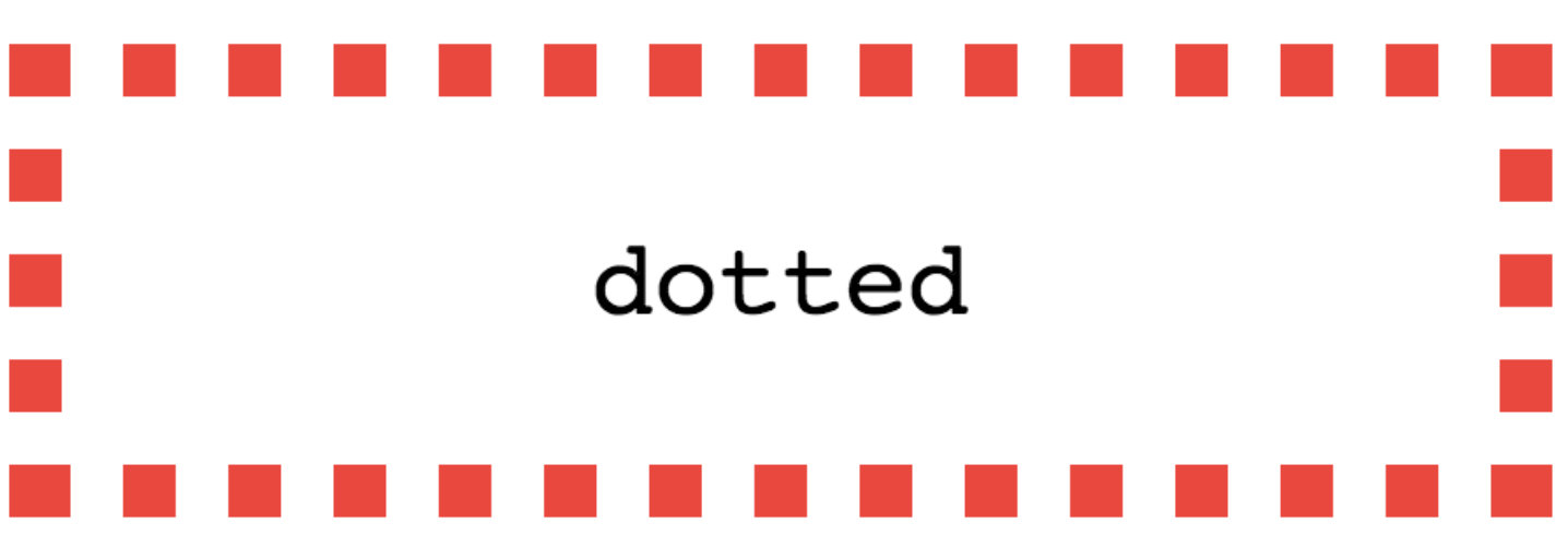
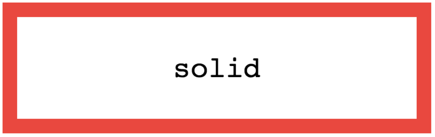
border-stylestyle of the border. there are many to explore!
p {
  border-style: dotted;
}
p {
  border-style: solid;
}
border-weightthickness of the border
p {
  border-style: solid;
  border-weight: 20px;
}

border-colorcolor of the border
p {
  border-style: solid;
  border-weight: 20px;
  border-color: lavender;
}

border-radiusroundedness of border corners
p {
  border: 10px purple solid;
  border-radius: 10px;
}

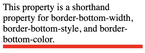
border-top-right-bottom-left
p {
  border-bottom-style: solid;
  border-bottom-weight: 6px;
  border-bottom-color: red;
}
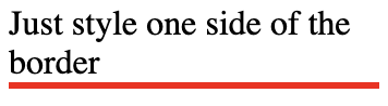
p {
  border-bottom: 6px solid red;
}
p {
  border-bottom: 6px solid red;
  border-left: 2px dashed blue;
  border-top: 3px inset yellow;
}

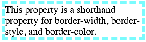
bordershorthand way to specify border width style, and color all at once.
p {
  border: 5px dashed cyan;
}
Position and sizing
More in detail demos and descriptions in Lesson 4!
Positions:
static- Static is the default positioning, where the elements will follow the normal flow of a web page.
fixed- A fixed element is positioned relative to the viewport.
- The element's position relative to the screen will not change even if the user scrolls.
relative- An element with
position: relative;is positioned relative to its default static position.
- An element with
absolute- An absolute element is positioned relative to the nearest positioned ancestor (instead of positioned relative to the viewport, like fixed).
- Can use this to layer on top or under other elements
sticky- Sticky is very similar to relative in terms of positioning.
- However, when the user scroll to the element, the element will become
fixedposition and "stick" on the screen.
Sizing:
height/width- size of the element itself.
- Units:
px- Standard pixel sizing
%- Percentage of the parent element
rem/em- rem: relative to the size of the root element's text
- em: relative to the size of the element's text
vh/vw- Size relative to the viewport height (vh) or width (vw)
- Usage is strongly recommended against. Very often the source of buggy UIs.
Background
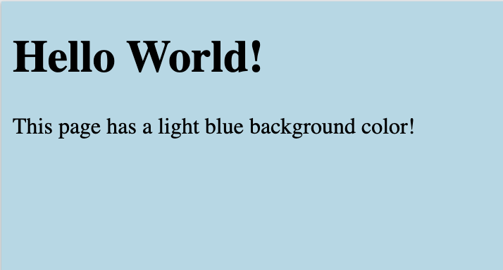
background-colorspecifies color to use as the backgroundbody {
background-color: lightblue;
}
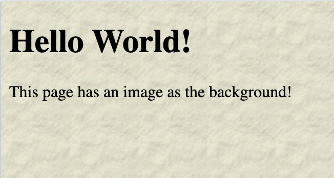
background-imagespecify image url to use as backgroundbody {
background-image: url("paper.gif");
}
background-positionspecify where the image goes relative to viewportbody {
background-image: url("img_tree.png");
background-position: left top;
}
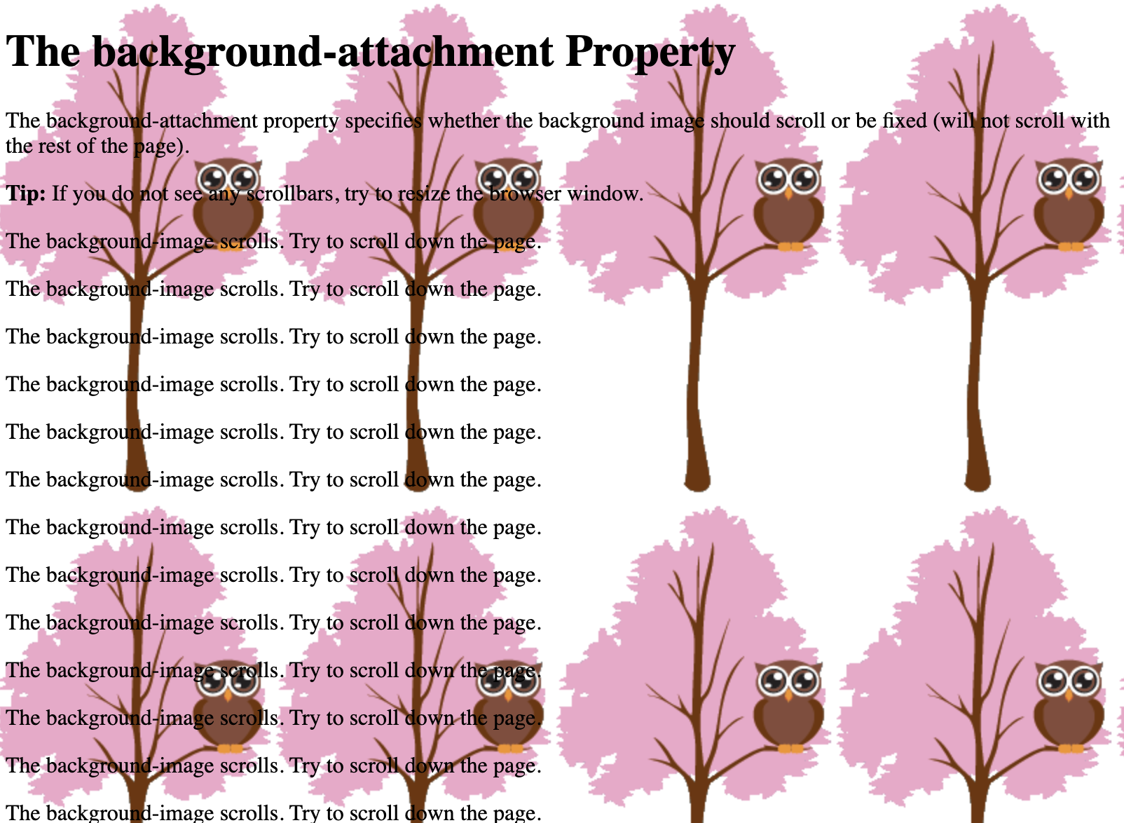
background-repeatspecifies if the background image repeats (defaults repeat)body {
background-image: url("img_tree.png");
background-repeat: repeat;
background-position: left top;
}
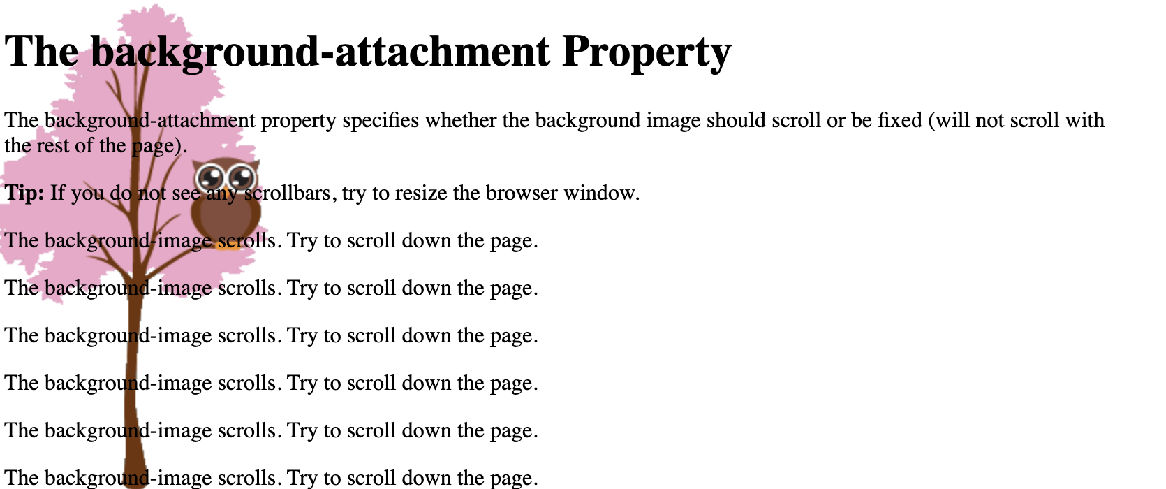
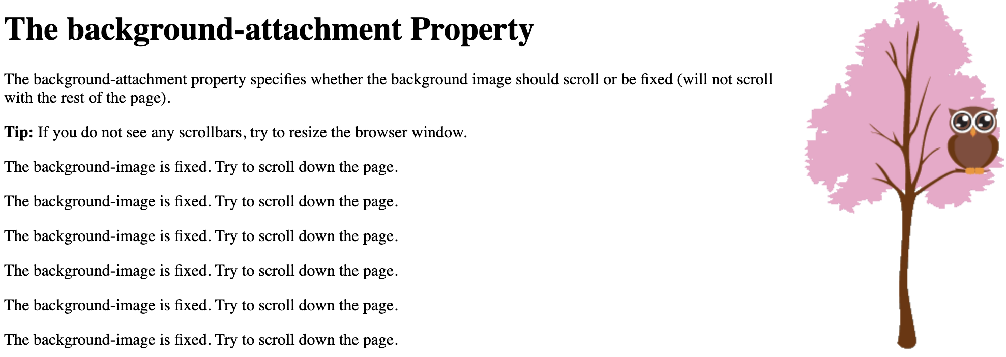
background-attachmentyou can choose how the background image moves as the user scrolls (default scroll)body {
background-image: url("img_tree.png");
background-attachment: fixed;
background-position: right top;
}
backgroundshorthand for all values in one linebody {
background: #ffffff url("img_tree.png") no-repeat right top;
margin-right: 200px;
}
Order of values
background-color
background-image
background-repeat
background-attachment
background-position
Colors
predefined colorsCSS comes with preset color values- eg. yellow, blue, pink, lavender, cyan, purple, etc...
rgbaFormatted as a list wrapped in parenthesis: (100, 200, 40, 50)- Max is 255 for the first three values
- r: red value
- g: green value
- b: blue value
- a: opacity
rgbFormatted as a list wrapped in parenthesis: (100, 200, 40)- Max is 255 for all values
- r: red value
- g: green value
- b: blue value
- defaults to 100% opacity
hexhexadecimal representation of color- starts with #
- followed by a six digit string of numbers between 0-9 and letters between a-f
- #000000 is black and #ffffff is white
Box Model (Height, Width, Padding, Border, and Margin)
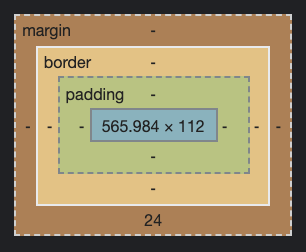
Content
The width and height directly affect the size of the content in the box.
Gift Box Analogy: The size of the present inside of the box
Padding
The padding affects how much space there is between the content and the container that holds it.
Gift Box Analogy: The packaging peanuts
Border
The border wraps around the padding and the content.
Gift Box Analogy: Wrapping paper
Margin
The margin is the amount of space between the container and elements around it.
Gift Box Analogy: Distance to another present
Life Hack of the Century: Dev Tools!
Developer tools are the single most useful set of tools you will encounter in web development
They are built into your browser. To open, hit control/command + shift + c. Or right click and press inspect
These tools let you dig into your DOM and search through you code to see where things are and why things behave the way they do
From static sites to full-stack web applications, this will be your frontend best friend.
What can you do with dev tools?
- Click on divs and see their exact styling and where the styling is coming from.
- Run lighthouse testing to see how speedy and accessible your site is.
- Make updates to your code and see updates in real time before changing it in your real code.
- Check the network tab to see server responses and interactions.
Enough talk, let's open up those dev tools!
StarterCSS is a beginner-friendly devtools extension to shorten time spent Googling for CSS docs and tutorials. If you're looking to ease into CSS and Devtools, we recommend you check it out!
Conclusion
- CSS is the furniture, the wallpaper, the vibes of the house.
- Without CSS, we would never want to visit the internet ever again.
- CSS can be finicky and annoying to grasp at first, but with dev tools, patience, and practice, you'll be able to handle any styling problem in an instant!
Contributors